IvanKaramazov
Footballguy
Minnesota is still charming, just not so much the Cities.Old flag is >>>>>>>>>>these 3 options. I grew up in MN. This reinforces my thought that MN is a great place to be from.
Minnesota is still charming, just not so much the Cities.Old flag is >>>>>>>>>>these 3 options. I grew up in MN. This reinforces my thought that MN is a great place to be from.
Uffda should be the state motto.And the winner is?
The Caribbean Dictator Flag.
"The commission settled on a flag design, choosing the submission with the white, green and blue stripes and an eight point star on the left. The commission will be making some changes to the flag to try to make it more "Minnesota" looking. "
Uh-huh.
Mmm, not much representation of MN.
Native Americans legacy, Vikings (not the football team), 10k lakes, Paul Bunyan, farming, iron range, boundary waters, farming, flour milling, pine trees, hunting, fishing, mosquitos, boating,mall of america,hockey, green bean casserole, "pop", "uffda"!
ETA: I guess the green bean casserole is represented by the green stripe.
 :)")
Choice 3 is heinous.Well I just voted for the USFL, and the FBG community is no help as all 3 options are now tied at 11
ETA: Boo, just saw that the decision has already been made. Any were better than the current one.
Please explain this to someone who’s never seen the flag.Current flag is terribly terrible. Also a little racistWhy are they changing it?
The picture ink is in the first post. Might have something to do with the Redskin in the background. Not a good look.Please explain this to someone who’s never seen the flag.Current flag is terribly terrible. Also a little racistWhy are they changing it?
There used to be Indians in Minnesota. (There still are.)The picture ink is in the first post. Might have something to do with the Redskin in the background. Not a good look.Please explain this to someone who’s never seen the flag.Current flag is terribly terrible. Also a little racistWhy are they changing it?
I tried to view it and got like 20% which didn’t show me anything.The picture ink is in the first post. Might have something to do with the Redskin in the background. Not a good look.Please explain this to someone who’s never seen the flag.Current flag is terribly terrible. Also a little racistWhy are they changing it?

 www.mprnews.org
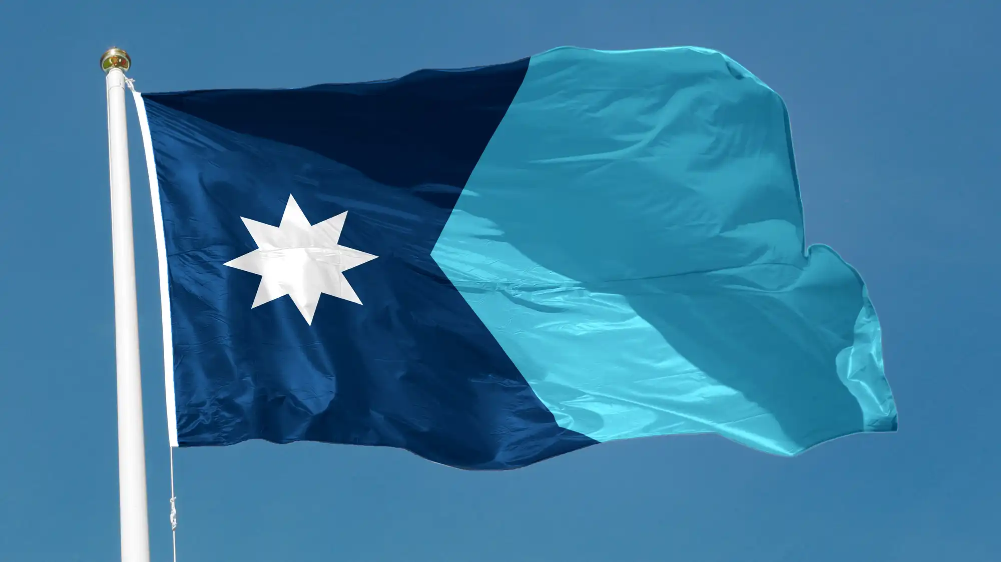
is that the final on in the picture?I guess after the tweaks I actually like the final design.
Let it fly: Minnesota officially has a new flag
The State Emblems Redesign Commission made its final edits to the new state flag. The banner will go up in May unless lawmakers intervene.
Yes, it appears they traded in the multi-color mess for a very pleasing and Minnesota-esque blue.is that the final on in the picture?I guess after the tweaks I actually like the final design.
Let it fly: Minnesota officially has a new flag
The State Emblems Redesign Commission made its final edits to the new state flag. The banner will go up in May unless lawmakers intervene.
If so I like it
That's much better. But it's kind of funny that they took one look at the winning design and were like "No, we're not doing that dontchaknow."I guess after the tweaks I actually like the final design.
Let it fly: Minnesota officially has a new flag
The State Emblems Redesign Commission made its final edits to the new state flag. The banner will go up in May unless lawmakers intervene.
So I just want to get this straight. They did a contest and boiled it down to three designs (all pretty bad). They then put those three designs up for vote. Then the design that won will be changed for the official flag.And the winner is?
The Caribbean Dictator Flag.
"The commission settled on a flag design, choosing the submission with the white, green and blue stripes and an eight point star on the left. The commission will be making some changes to the flag to try to make it more "Minnesota" looking. "
Uh-huh.
My town opened a new children's museum like 15 years ago. They held a community contest to come up with a name for the mascot. I'm sure there were some bad and/or hoax suggestions tossed away in there of the Boaty-McBoatface variety, but the finalists were all pretty darn good ideas that assorted kids came up with.So I just want to get this straight. They did a contest and boiled it down to three designs (all pretty bad). They then put those three designs up for vote. Then the design that won will be changed for the official flag.
WTF? Why even go through those motions?
Minnesota is pretty banana republic in operation.So I just want to get this straight. They did a contest and boiled it down to three designs (all pretty bad). They then put those three designs up for vote. Then the design that won will be changed for the official flag.And the winner is?
The Caribbean Dictator Flag.
"The commission settled on a flag design, choosing the submission with the white, green and blue stripes and an eight point star on the left. The commission will be making some changes to the flag to try to make it more "Minnesota" looking. "
Uh-huh.
WTF? Why even go through those motions?
Love itI guess after the tweaks I actually like the final design.
Let it fly: Minnesota officially has a new flag
The State Emblems Redesign Commission made its final edits to the new state flag. The banner will go up in May unless lawmakers intervene.
To let people feel involved, even if they really have no say.So I just want to get this straight. They did a contest and boiled it down to three designs (all pretty bad). They then put those three designs up for vote. Then the design that won will be changed for the official flag.
WTF? Why even go through those motions?