What's new
Fantasy Football - Footballguys Forums

Welcome to Our Forums. Once you've registered and logged in, you're primed to talk football, among other topics, with the sharpest and most experienced fantasy players on the internet.

What should be the new Minnesota State flag? (1 Viewer)

Which should be the new Minnesota state flag

  • 2100 - The PowerPoint Flag

    Votes: 12 33.3%
  • 1953 - The Caribbean Dictator Flag

    Votes: 13 36.1%
  • 944 - The USFL Flag

    Votes: 11 30.6%

  • Total voters
    36

Andy Dufresne

Footballguy
Minnesota has followed the usual "We did this by committee so there are no good options to choose from" process, so here we are.

The upside is that it's replacing the existing Pawnee-esque flag.

So which is your choice?

Design 2100 - Blue with star on top, white separator, green below

Design 1953 - Arrowhead-less Minnesota on the left barfing Easter Skittles

Design 944 - The USFL's Breakers
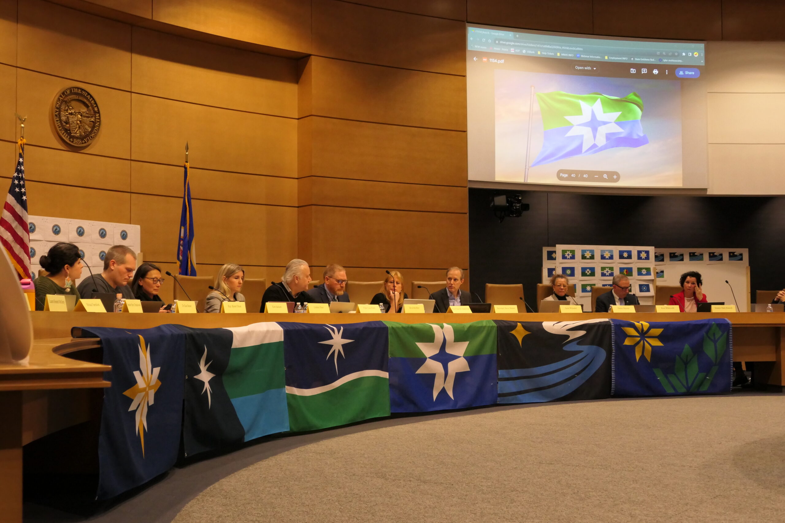
 
With the caveat that they are all probably better than the existing flag, I don't like that they all scream "current year" in their style, similar to the way e.g. the Eagles and Patriots logos could never be confused for something designed in the 70s. I guess I would hope for something a little more timeless. That said, I voted 944 because it seems the most Minnesota specific.
 
With the caveat that they are all probably better than the existing flag, I don't like that they all scream "current year" in their style, similar to the way e.g. the Eagles and Patriots logos could never be confused for something designed in the 70s. I guess I would hope for something a little more timeless. That said, I voted 944 because it seems the most Minnesota specific.
I'd stick with the Pawnee flag for this reason. Yeah, it's ugly, but it has character.
 
As a Vikings fan (and not someone that is from Minnesota or ever lived there), the colors seem off to me. I would put in some purple and the Viking logo in there somewhere.
 
Last edited:
With the caveat that they are all probably better than the existing flag, I don't like that they all scream "current year" in their style, similar to the way e.g. the Eagles and Patriots logos could never be confused for something designed in the 70s. I guess I would hope for something a little more timeless. That said, I voted 944 because it seems the most Minnesota specific.
totally agree with the bold
 
As a Vikings fan (and not someone that is from Minnesota or every lived there), the colors seem off to me. I would put in some purple and the Viking logo in there somewhere.
They could include a little cartoon of Gary Anderson missing that FG.

Edit: Too soon?
Way too damn soon!

There needs to be a "none of the above and go back to the drawing room" option.
Committees, ugh.
 
how about a picture of some driving too slow in the passing lane and then waiving in a fake nice way as you go around them in the slow lane that would pretty much sum up the whole place take that to the bank brohans
 
I was thinking Puerto Rico for #2, but then I realized Puerto Rico and Cuba's flags are the exact same with inverted colors.

But anyway, not green Cuba.

#3 looks the coolest, but doesn't look like a flag.

#1 is the winner here. It's not amazing, but it's a lot better than that awful one they have now.
 
As a Vikings fan (and not someone that is from Minnesota or every lived there), the colors seem off to me. I would put in some purple and the Viking logo in there somewhere.
They could include a little cartoon of Gary Anderson missing that FG.
Now that would be symbolic of Minnesota for sure........and timeless
You could maybe add Brett Favre throwing that inexplicable interception.
Or maybe just a big goose egg ... we would all know what it means.
 
As a Vikings fan (and not someone that is from Minnesota or every lived there), the colors seem off to me. I would put in some purple and the Viking logo in there somewhere.
They could include a little cartoon of Gary Anderson missing that FG.
Now that would be symbolic of Minnesota for sure........and timeless
You could maybe add Brett Favre throwing that inexplicable interception.
That interception wasn't as bad as it seems. They were on the outskirts of FG range due to a 12 men in the huddle coming out of a time out penalty. That was more inexplicable and a bigger impact. Childress in a noose with a baffling look would be a better logo...
 
Or maybe just a big goose egg ... we would all know what it means.
Not to pick a fight, but I did notice that one of the earlier submissions included two dark ducks and a grey duck, which I assume only residents of MN and neighboring states will "get."
well, fill us non-native to Minnesota people in on the meaning....
 
  • Like
Reactions: Zow
Voted 944 bc
1) Original Breakers helmets were cool

2) it would be instantly recognizable once adopted which is a hallmark of good flag design.

-QG
 
Reminds me of my favorite episode of 99% invisible. I voted #2

criteria for good flag design:
  1. Keep It Simple (The flag should be so simple that a child can draw it from memory)
  2. Use Meaningful Symbolism (The flag’s images, colors, or patterns should relate to what it symbolizes)
  3. Use 2 to 3 Basic Colors (Limit the number of colors on the flag to three, which contrast well and come from the standard color set)
  4. No Lettering or Seals (Never use writing of any kind or an organization’s seal)
  5. Be Distinctive or Be Related (Avoid duplicating other flags, but use similarities to show connections)
 
Or maybe just a big goose egg ... we would all know what it means.
Not to pick a fight, but I did notice that one of the earlier submissions included two dark ducks and a grey duck, which I assume only residents of MN and neighboring states will "get."
well, fill us non-native to Minnesota people in on the meaning....
the civilized world plays duck duck goose but in minnesota where apparently they still live in huts and carry spears they play duck duck grey duck your guess is as good as mine why but i suspect no one in minnesota could spell goose and here we are take that to the bank brochachos
 
As a native Texan, the second option (1953) looks like a wanna be plagiarized version of our flag. Get your own flag Minnesota.
 
As a native Texan, the second option (1953) looks like a wanna be plagiarized version of our flag. Get your own flag Minnesota.
I am a flag nerd and that never made me think of Texas. there are a ton of Middle Eastern and African flags that are way more similar and then the Bahamas and Cuba as well.
 
And the winner is?

The Caribbean Dictator Flag.

"The commission settled on a flag design, choosing the submission with the white, green and blue stripes and an eight point star on the left. The commission will be making some changes to the flag to try to make it more "Minnesota" looking. "

Uh-huh. :rolleyes:

Mmm, not much representation of MN.
Native Americans legacy, Vikings (not the football team), 10k lakes, Paul Bunyan, farming, iron range, boundary waters, farming, flour milling, pine trees, hunting, fishing, mosquitos, boating,mall of america,hockey, green bean casserole, "pop", "uffda"!

ETA: I guess the green bean casserole is represented by the green stripe 😐.
 
Last edited:

Users who are viewing this thread

Top